
Daily chart
Pollution in cities by hour of the day
- Nitrogen dioxide
- Particulate matter
- Air quality
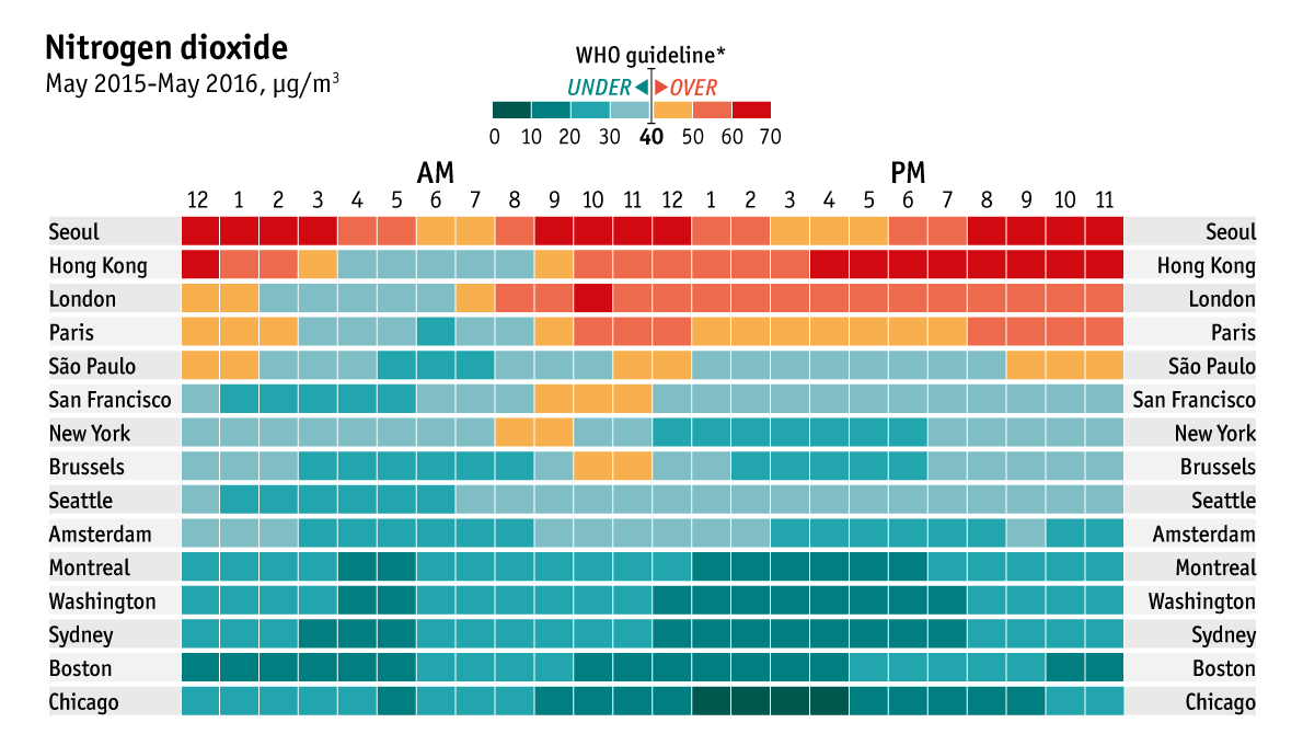
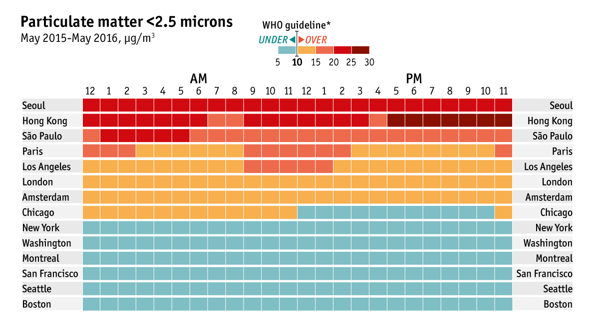

GAUGING the severity of air pollution can be a tricky task for city dwellers. One common measure is the annual average concentration of a given pollutant, which is typically compared against the World Health Organisation’s guidelines. However, patterns of pollution during the day can be more revealing about residents’ routine exposure, and how it differs from place to place. Using 12 months’ worth of data collected from May 2015 onwards, we have calculated these daily figures for 16 big cities. The charts above for nitrogen dioxide and particulate matter smaller than 2.5 microns across show how the health risks from routine exposure to these two pollutants vary. The third chart shows the additional daily risk of death resulting from air quality, which can occur when brief and relatively small spikes in pollution cause strokes or heart attacks. For the index in this chart, we used the formula for Canada’s Air Quality Health Index, which measures the combined effects of nitrogen dioxide, particulate matter and ground-level ozone. A one-point increase in the maximum daily index is associated with a 1% increase in the number of deaths in a given city on any given day, regardless of cause.
On all three measures Seoul and Hong Kong are the worst among the cities in our sample. In Europe, London and Paris stand out—daytime pollution there is consistently higher than the WHO’s guidelines. New York and several other American cities have much cleaner air, partly because diesel fuel (which emits more nitrogen dioxide) is less common in the United States. Pollution tends to rise steeply in the morning, and is lowest in the middle of the night. The ebbs and flows during daytime vary across cities. In some, residents may be able to reduce their exposure to pollution by changing their daily routines, such as commuting to work an hour earlier.
Note: Data from some measures were not available for all cities.


No comments:
Post a Comment